- NumPy Tutorial
- NumPy - Home
- NumPy - Introduction
- NumPy - Environment
- NumPy - Ndarray Object
- NumPy - Data Types
- NumPy - Array Attributes
- NumPy - Array Creation Routines
- NumPy - Array from Existing Data
- Array From Numerical Ranges
- NumPy - Indexing & Slicing
- NumPy - Advanced Indexing
- NumPy - Broadcasting
- NumPy - Iterating Over Array
- NumPy - Array Manipulation
- NumPy - Binary Operators
- NumPy - String Functions
- NumPy - Mathematical Functions
- NumPy - Arithmetic Operations
- NumPy - Statistical Functions
- Sort, Search & Counting Functions
- NumPy - Byte Swapping
- NumPy - Copies & Views
- NumPy - Matrix Library
- NumPy - Linear Algebra
- NumPy - Matplotlib
- NumPy - Histogram Using Matplotlib
- NumPy - I/O with NumPy
- NumPy Useful Resources
- NumPy Compiler
- NumPy - Quick Guide
- NumPy - Useful Resources
- NumPy - Discussion
NumPy - Histogram Using Matplotlib
NumPy has a numpy.histogram() function that is a graphical representation of the frequency distribution of data. Rectangles of equal horizontal size corresponding to class interval called bin and variable height corresponding to frequency.
numpy.histogram()
The numpy.histogram() function takes the input array and bins as two parameters. The successive elements in bin array act as the boundary of each bin.
import numpy as np

a = np.array([22,87,5,43,56,73,55,54,11,20,51,5,79,31,27])
np.histogram(a,bins = [0,20,40,60,80,100])
hist,bins = np.histogram(a,bins = [0,20,40,60,80,100])
print hist
print bins
It will produce the following output −
[3 4 5 2 1]
[0 20 40 60 80 100]
plt()
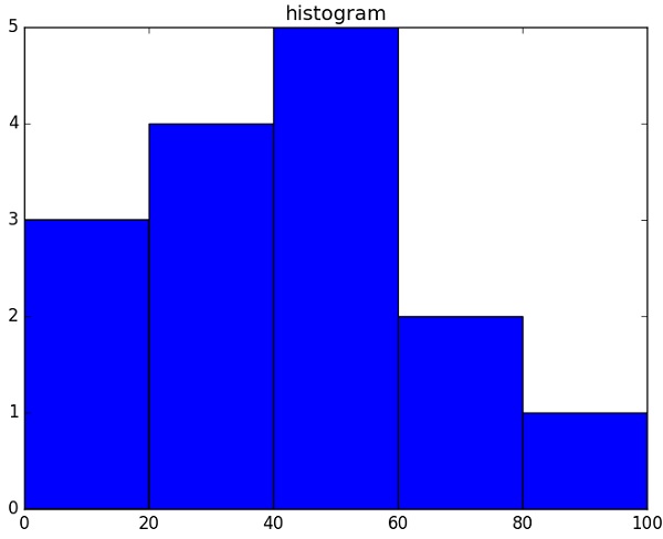
Matplotlib can convert this numeric representation of histogram into a graph. The plt() function of pyplot submodule takes the array containing the data and bin array as parameters and converts into a histogram.
from matplotlib import pyplot as plt
import numpy as np

a = np.array([22,87,5,43,56,73,55,54,11,20,51,5,79,31,27])
plt.hist(a, bins = [0,20,40,60,80,100])
plt.title("histogram")
plt.show()
It should produce the following output −

Advertisements