- Matplotlib Basics
- Matplotlib - Home
- Matplotlib - Introduction
- Matplotlib - Vs Seaborn
- Matplotlib - Environment Setup
- Matplotlib - Anaconda distribution
- Matplotlib - Jupyter Notebook
- Matplotlib - Pyplot API
- Matplotlib - Simple Plot
- Matplotlib - Saving Figures
- Matplotlib - Markers
- Matplotlib - Figures
- Matplotlib - Styles
- Matplotlib - Legends
- Matplotlib - Colors
- Matplotlib - Colormaps
- Matplotlib - Colormap Normalization
- Matplotlib - Choosing Colormaps
- Matplotlib - Colorbars
- Matplotlib - Text
- Matplotlib - Text properties
- Matplotlib - Subplot Titles
- Matplotlib - Images
- Matplotlib - Image Masking
- Matplotlib - Annotations
- Matplotlib - Arrows
- Matplotlib - Fonts
- Matplotlib - What are Fonts?
- Setting Font Properties Globally
- Matplotlib - Font Indexing
- Matplotlib - Font Properties
- Matplotlib - Scales
- Matplotlib - Linear and Logarthmic Scales
- Matplotlib - Symmetrical Logarithmic and Logit Scales
- Matplotlib - LaTeX
- Matplotlib - What is LaTeX?
- Matplotlib - LaTeX for Mathematical Expressions
- Matplotlib - LaTeX Text Formatting in Annotations
- Matplotlib - PostScript
- Enabling LaTex Rendering in Annotations
- Matplotlib - Mathematical Expressions
- Matplotlib - Animations
- Matplotlib - Artists
- Matplotlib - Styling with Cycler
- Matplotlib - Paths
- Matplotlib - Path Effects
- Matplotlib - Transforms
- Matplotlib - Ticks and Tick Labels
- Matplotlib - Radian Ticks
- Matplotlib - Dateticks
- Matplotlib - Tick Formatters
- Matplotlib - Tick Locators
- Matplotlib - Basic Units
- Matplotlib - Autoscaling
- Matplotlib - Reverse Axes
- Matplotlib - Logarithmic Axes
- Matplotlib - Symlog
- Matplotlib - Unit Handling
- Matplotlib - Ellipse with Units
- Matplotlib - Spines
- Matplotlib - Axis Ranges
- Matplotlib - Axis Scales
- Matplotlib - Axis Ticks
- Matplotlib - Formatting Axes
- Matplotlib - Axes Class
- Matplotlib - Twin Axes
- Matplotlib - Figure Class
- Matplotlib - Multiplots
- Matplotlib - Grids
- Matplotlib - Object-oriented Interface
- Matplotlib - PyLab module
- Matplotlib - Subplots() Function
- Matplotlib - Subplot2grid() Function
- Matplotlib - Anchored Artists
- Matplotlib - Manual Contour
- Matplotlib - Coords Report
- Matplotlib - AGG filter
- Matplotlib - Ribbon Box
- Matplotlib - Fill Spiral
- Matplotlib - Findobj Demo
- Matplotlib - Hyperlinks
- Matplotlib - Image Thumbnail
- Matplotlib - Plotting with Keywords
- Matplotlib - Create Logo
- Matplotlib - Multipage PDF
- Matplotlib - Multiprocessing
- Matplotlib - Print Stdout
- Matplotlib - Compound Path
- Matplotlib - Sankey Class
- Matplotlib - MRI with EEG
- Matplotlib - Stylesheets
- Matplotlib - Background Colors
- Matplotlib - Basemap
- Matplotlib Event Handling
- Matplotlib - Event Handling
- Matplotlib - Close Event
- Matplotlib - Mouse Move
- Matplotlib - Click Events
- Matplotlib - Scroll Event
- Matplotlib - Keypress Event
- Matplotlib - Pick Event
- Matplotlib - Looking Glass
- Matplotlib - Path Editor
- Matplotlib - Poly Editor
- Matplotlib - Timers
- Matplotlib - Viewlims
- Matplotlib - Zoom Window
- Matplotlib Plotting
- Matplotlib - Bar Graphs
- Matplotlib - Histogram
- Matplotlib - Pie Chart
- Matplotlib - Scatter Plot
- Matplotlib - Box Plot
- Matplotlib - Violin Plot
- Matplotlib - Contour Plot
- Matplotlib - 3D Plotting
- Matplotlib - 3D Contours
- Matplotlib - 3D Wireframe Plot
- Matplotlib - 3D Surface Plot
- Matplotlib - Quiver Plot
- Matplotlib Useful Resources
- Matplotlib - Quick Guide
- Matplotlib - Useful Resources
- Matplotlib - Discussion
Matplotlib - Choosing Colormaps
Colormap also known as a color table or a palette, is a range of colors that represents a continuous range of values. Allowing you to represent information effectively through color variations.
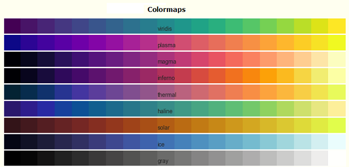
See the below image referencing a few built-in colormaps in matplotlib −

Matplotlib offers a variety of built-in (available in matplotlib.colormaps module) and third-party colormaps for various applications.
Choosing Colormaps in Matplotlib
Choosing an appropriate colormap involves finding a suitable representation in 3D colorspace for your dataset.
The factors for selecting an appropriate colormap for any given data set include −
Nature of Data − Whether representing form or metric data
Knowledge of the Dataset − Understanding the dataset's characteristics.
Intuitive Color Scheme − Considering if there's an intuitive color scheme for the parameter being plotted.
Field Standards − Considering if there is a standard in the field the audience may be expecting.
A perceptually uniform colormap is recommended for most of the applications, ensuring equal steps in data are perceived as equal steps in the color space. This improves human brain interpretation, particularly when changes in lightness are more perceptible than changes in hue.
Categories of Colormaps
Colormaps are categorized based on their function −
Sequential − Incremental changes in lightness and saturation, often using a single hue. Suitable for representing ordered information.
Diverging − Changes in lightness and saturation of two colors, meeting at an unsaturated color. Ideal for data with a critical middle value, like topography or data deviating around zero.
Cyclic − Changes in the lightness of two colors, meeting at the middle and beginning/end at an unsaturated color. Suitable for values that wrap around at endpoints, such as phase angle or time of day.
Qualitative − Miscellaneous colors with no specific order. Used for representing information without ordering or relationships.
Sequential Colormaps
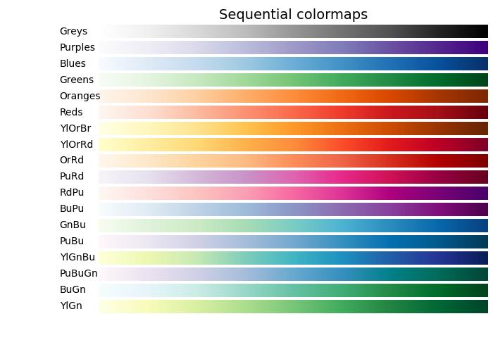
Sequential colormaps show a monotonically increasing in lightness values as they increase through the colormap. This characteristic ensures a smooth transition in the perception of color changes, making them suitable for representing ordered information. However, it's essential to note that the perceptual range may vary among colormaps, depending on the range of values they span.
Let's explore Sequential colormaps by visualizing their gradients and understanding how their lightness values evolve.
Example
The following example provides a visual representation of the gradients for different Sequential colormaps available in Matplotlib.
import matplotlib.pyplot as plt
import numpy as np
import matplotlib as mpl

# List of Sequential colormaps to visualize
cmap_list = ['Greys', 'Purples', 'Blues', 'Greens', 'Oranges', 'Reds',
   'YlOrBr', 'YlOrRd', 'OrRd', 'PuRd', 'RdPu', 'BuPu',
   'GnBu', 'PuBu', 'YlGnBu', 'PuBuGn', 'BuGn', 'YlGn']

# Plot the color gradients

gradient = np.linspace(0, 1, 256)
gradient = np.vstack((gradient, gradient))

# Create figure and adjust figure height to the number of colormaps
nrows = len(cmap_list)
figh = 0.35 + 0.15 + (nrows + (nrows - 1) * 0.1) * 0.22
fig, axs = plt.subplots(nrows=nrows + 1, figsize=(7, figh))
fig.subplots_adjust(top=1 - 0.35 / figh, bottom=0.15 / figh,
   left=0.2, right=0.99)
axs[0].set_title('Sequential colormaps', fontsize=14)

for ax, name in zip(axs, cmap_list):
   ax.imshow(gradient, aspect='auto', cmap=mpl.colormaps[name])
   ax.text(-0.1, 0.5, name, va='center', ha='right', fontsize=10,
      transform=ax.transAxes)

# Turn off all ticks & spines, not just the ones with colormaps.
for ax in axs:
   ax.set_axis_off()

# Show the plot
plt.show()
Output
On executing the above code we will get the following output −

Diverging Colormaps
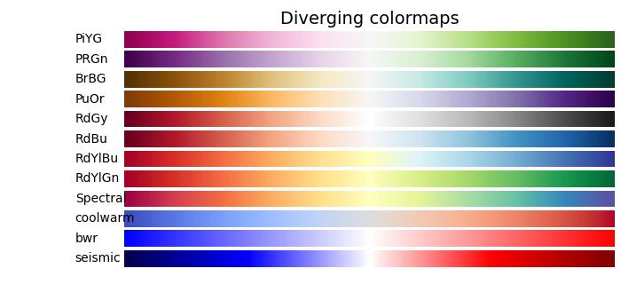
Diverging colormaps are characterized by monotonically increasing and then decreasing lightness values, with the maximum lightness close to a neutral midpoint.
Example
The following example provides a visual representation of the gradients for different Diverging colormaps available in Matplotlib.
import matplotlib.pyplot as plt
import numpy as np
import matplotlib as mpl

# List of Diverging colormaps to visualize
cmap_list = ['PiYG', 'PRGn', 'BrBG', 'PuOr', 'RdGy', 'RdBu', 'RdYlBu',
   'RdYlGn', 'Spectral', 'coolwarm', 'bwr', 'seismic']

# Plot the color gradients
gradient = np.linspace(0, 1, 256)
gradient = np.vstack((gradient, gradient))

# Create figure and adjust figure height to the number of colormaps
nrows = len(cmap_list)
figh = 0.35 + 0.15 + (nrows + (nrows - 1) * 0.1) * 0.22
fig, axs = plt.subplots(nrows=nrows + 1, figsize=(7, figh))
fig.subplots_adjust(top=1 - 0.35 / figh, bottom=0.15 / figh,
   left=0.2, right=0.99)
axs[0].set_title('Diverging colormaps', fontsize=14)

for ax, name in zip(axs, cmap_list):
   ax.imshow(gradient, aspect='auto', cmap=mpl.colormaps[name])
   ax.text(-0.1, 0.5, name, va='center', ha='left', fontsize=10,
      transform=ax.transAxes)

# Turn off all ticks & spines, not just the ones with colormaps.
for ax in axs:
   ax.set_axis_off()

# Show the plot
plt.show()
Output
On executing the above code we will get the following output −

Cyclic Colormaps
Cyclic colormaps present a unique design where the colormap starts and ends on the same color, meeting at a symmetric center point. The progression of lightness values should change monotonically from the start to the middle and inversely from the middle to the end.
Example
In the following example, you can explore and visualize various Cyclic colormaps available in Matplotlib.
import matplotlib.pyplot as plt
import numpy as np
import matplotlib as mpl

# List of Cyclic colormaps to visualize
cmap_list = ['twilight', 'twilight_shifted', 'hsv']

# Plot the color gradients
gradient = np.linspace(0, 1, 256)
gradient = np.vstack((gradient, gradient))

# Create figure and adjust figure height to the number of colormaps
nrows = len(cmap_list)
figh = 0.35 + 0.15 + (nrows + (nrows - 1) * 0.1) * 0.22
fig, axs = plt.subplots(nrows=nrows + 1, figsize=(7, figh))
fig.subplots_adjust(top=1 - 0.35 / figh, bottom=0.15 / figh,
   left=0.2, right=0.99)
axs[0].set_title('Cyclic colormaps', fontsize=14)

for ax, name in zip(axs, cmap_list):
   ax.imshow(gradient, aspect='auto', cmap=mpl.colormaps[name])
   ax.text(-0.1, 0.5, name, va='center', ha='left', fontsize=10,
      transform=ax.transAxes)

# Turn off all ticks & spines, not just the ones with colormaps.
for ax in axs:
   ax.set_axis_off()

# Show the plot
plt.show()
Output
On executing the above code we will get the following output −

Qualitative colormaps
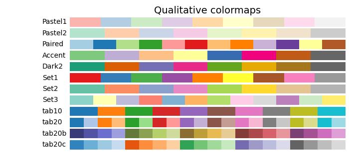
Qualitative colormaps are distinct from perceptual maps, as they are not designed to provide a perceptual uniformity but are rather intended for representing information that does not possess ordering or relationships. The lightness values vary widely throughout the colormap and are not monotonically increasing. As a result, Qualitative colormaps are not recommended for use as perceptual colormaps.
Example
The following example provides a visual representation of the different Qualitative colormaps available in Matplotlib.
import matplotlib.pyplot as plt
import numpy as np
import matplotlib as mpl

# List of Qualitative colormaps to visualize
cmap_list = ['Pastel1', 'Pastel2', 'Paired', 'Accent', 'Dark2',
   'Set1', 'Set2', 'Set3', 'tab10', 'tab20', 'tab20b', 'tab20c']

# Plot the color gradients
gradient = np.linspace(0, 1, 256)
gradient = np.vstack((gradient, gradient))

# Create figure and adjust figure height to the number of colormaps
nrows = len(cmap_list)
figh = 0.35 + 0.15 + (nrows + (nrows - 1) * 0.1) * 0.22
fig, axs = plt.subplots(nrows=nrows + 1, figsize=(7, figh))
fig.subplots_adjust(top=1 - 0.35 / figh, bottom=0.15 / figh,
   left=0.2, right=0.99)
axs[0].set_title('Qualitative colormaps', fontsize=14)

for ax, name in zip(axs, cmap_list):
   ax.imshow(gradient, aspect='auto', cmap=mpl.colormaps[name])
   ax.text(-0.1, 0.5, name, va='center', ha='left', fontsize=10,
      transform=ax.transAxes)

# Turn off all ticks & spines, not just the ones with colormaps.
for ax in axs:
   ax.set_axis_off()

# Show the plot
plt.show()
Output
On executing the above code we will get the following output −
