- Matplotlib Basics
- Matplotlib - Home
- Matplotlib - Introduction
- Matplotlib - Vs Seaborn
- Matplotlib - Environment Setup
- Matplotlib - Anaconda distribution
- Matplotlib - Jupyter Notebook
- Matplotlib - Pyplot API
- Matplotlib - Simple Plot
- Matplotlib - Saving Figures
- Matplotlib - Markers
- Matplotlib - Figures
- Matplotlib - Styles
- Matplotlib - Legends
- Matplotlib - Colors
- Matplotlib - Colormaps
- Matplotlib - Colormap Normalization
- Matplotlib - Choosing Colormaps
- Matplotlib - Colorbars
- Matplotlib - Text
- Matplotlib - Text properties
- Matplotlib - Subplot Titles
- Matplotlib - Images
- Matplotlib - Image Masking
- Matplotlib - Annotations
- Matplotlib - Arrows
- Matplotlib - Fonts
- Matplotlib - What are Fonts?
- Setting Font Properties Globally
- Matplotlib - Font Indexing
- Matplotlib - Font Properties
- Matplotlib - Scales
- Matplotlib - Linear and Logarthmic Scales
- Matplotlib - Symmetrical Logarithmic and Logit Scales
- Matplotlib - LaTeX
- Matplotlib - What is LaTeX?
- Matplotlib - LaTeX for Mathematical Expressions
- Matplotlib - LaTeX Text Formatting in Annotations
- Matplotlib - PostScript
- Enabling LaTex Rendering in Annotations
- Matplotlib - Mathematical Expressions
- Matplotlib - Animations
- Matplotlib - Artists
- Matplotlib - Styling with Cycler
- Matplotlib - Paths
- Matplotlib - Path Effects
- Matplotlib - Transforms
- Matplotlib - Ticks and Tick Labels
- Matplotlib - Radian Ticks
- Matplotlib - Dateticks
- Matplotlib - Tick Formatters
- Matplotlib - Tick Locators
- Matplotlib - Basic Units
- Matplotlib - Autoscaling
- Matplotlib - Reverse Axes
- Matplotlib - Logarithmic Axes
- Matplotlib - Symlog
- Matplotlib - Unit Handling
- Matplotlib - Ellipse with Units
- Matplotlib - Spines
- Matplotlib - Axis Ranges
- Matplotlib - Axis Scales
- Matplotlib - Axis Ticks
- Matplotlib - Formatting Axes
- Matplotlib - Axes Class
- Matplotlib - Twin Axes
- Matplotlib - Figure Class
- Matplotlib - Multiplots
- Matplotlib - Grids
- Matplotlib - Object-oriented Interface
- Matplotlib - PyLab module
- Matplotlib - Subplots() Function
- Matplotlib - Subplot2grid() Function
- Matplotlib - Anchored Artists
- Matplotlib - Manual Contour
- Matplotlib - Coords Report
- Matplotlib - AGG filter
- Matplotlib - Ribbon Box
- Matplotlib - Fill Spiral
- Matplotlib - Findobj Demo
- Matplotlib - Hyperlinks
- Matplotlib - Image Thumbnail
- Matplotlib - Plotting with Keywords
- Matplotlib - Create Logo
- Matplotlib - Multipage PDF
- Matplotlib - Multiprocessing
- Matplotlib - Print Stdout
- Matplotlib - Compound Path
- Matplotlib - Sankey Class
- Matplotlib - MRI with EEG
- Matplotlib - Stylesheets
- Matplotlib - Background Colors
- Matplotlib - Basemap
- Matplotlib Event Handling
- Matplotlib - Event Handling
- Matplotlib - Close Event
- Matplotlib - Mouse Move
- Matplotlib - Click Events
- Matplotlib - Scroll Event
- Matplotlib - Keypress Event
- Matplotlib - Pick Event
- Matplotlib - Looking Glass
- Matplotlib - Path Editor
- Matplotlib - Poly Editor
- Matplotlib - Timers
- Matplotlib - Viewlims
- Matplotlib - Zoom Window
- Matplotlib Plotting
- Matplotlib - Bar Graphs
- Matplotlib - Histogram
- Matplotlib - Pie Chart
- Matplotlib - Scatter Plot
- Matplotlib - Box Plot
- Matplotlib - Violin Plot
- Matplotlib - Contour Plot
- Matplotlib - 3D Plotting
- Matplotlib - 3D Contours
- Matplotlib - 3D Wireframe Plot
- Matplotlib - 3D Surface Plot
- Matplotlib - Quiver Plot
- Matplotlib Useful Resources
- Matplotlib - Quick Guide
- Matplotlib - Useful Resources
- Matplotlib - Discussion
Matplotlib - Axis Scales
What is Axis Scale?
In Matplotlib library, axis scales refer to the method by which the values along an axis are displayed and spaced. Matplotlib supports various types of scales that affect how data is visualized and distributed along the axes.
There are different common Axis Scales in matplotlib library. They are,
Linear Scale (Default)
Logarithmic Scale
Symmetrical Logarithmic Scale (Symlog)
Choosing the appropriate axis scale depends on the nature of your data and the desired visualization. It's important to select a scale that effectively represents your data to convey accurate information in the plot.
Use Cases for Different Scales
Linear − Suitable for displaying data with uniform spacing between values.
Logarithmic − Useful for representing data covering a wide range of magnitudes.
Symmetrical Logarithmic − Ideal for datasets containing both positive and negative values without excluding zero.
Implementing Different Scales
Let’s see each and every scale in detail how they should be implemented in the plots.
Linear Scale
In Matplotlib the linear scale represents a standard linear coordinate system used for plotting data. It is the default scaling applied to both the x-axis and y-axis unless specified otherwise.
Characteristics of Linear Scale
Uniform Spacing − On a linear scale equal increments along the axis represent equal differences in the data. For instance the distance between 0 and 1 is the same as between 1 and 2.
Linear Relationship − Data points plotted on a linear scale adhere to a linear relationship where changes in the plotted points are proportional to the changes in the data.
Example
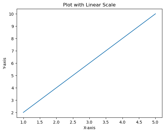
In this example the x-axis and y-axis use a linear scale by default. Each unit along the axis represents a constant increment in the data.
import matplotlib.pyplot as plt
# Sample data
x = [1, 2, 3, 4, 5]
y = [2, 4, 6, 8, 10]
# Creating a plot with linear scale (default)
plt.plot(x, y)
plt.xlabel('X-axis')
plt.ylabel('Y-axis')
plt.title('Plot with Linear Scale')
plt.show()
Output
Logarithmic Scale
In Matplotlib we can set a logarithmic scale for an axis using the plt.xscale() and plt.yscale() functions or their corresponding methods ax.set_xscale() and ax.set_yscale() when working with an axis object ax. These functions allow us to change the scale of the axis to logarithmic.
Syntax
The below is the syntax for changing the x-axis to the logarithmic scale using, plt.xscale() −
plt.xscale('log')
ax.set_xscale()
ax.set_xscale('log')
The below is the syntax for changing the y-axis to the logarithmic scale using, plt.yscale() −
plt.yscale('log')
Using ax.set_yscale()
ax.set_yscale('log')
Example
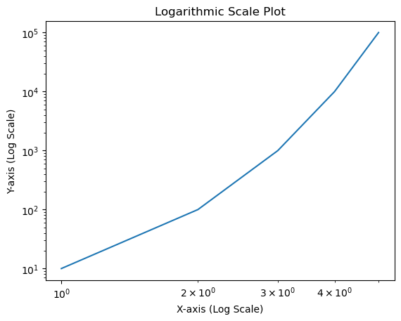
Here's an example demonstrating how to set a logarithmic scale for the x-axis and y-axes
import matplotlib.pyplot as plt
# Sample data
x = [1, 2, 3, 4, 5]
y = [10, 100, 1000, 10000, 100000]
# Creating a plot with logarithmic scale on both axes
plt.plot(x, y)
# Setting logarithmic scale for x-axis and y-axis
plt.xscale('log')
plt.yscale('log')
plt.xlabel('X-axis (Log Scale)')
plt.ylabel('Y-axis (Log Scale)')
plt.title('Logarithmic Scale Plot')
plt.show()
Output
Symmetrical Logarithmic Scale (Symlog)
In Matplotlib the symmetric logarithmic scale is often referred to as symlog which allows plotting data on a logarithmic scale while also accommodating both positive and negative values symmetrically around zero.
The symlog scale combines linear scaling for values close to zero and logarithmic scaling for values farther from zero.
Syntax
Here's the syntax to set a symmetric logarithmic scale for an axis −
For the x-axis
plt.xscale('symlog', linthresh=base, linscale=lin_scale)
For the y-axis
plt.yscale('symlog', linthresh=base, linscale=lin_scale)
Where,
linthresh − Linear threshold value that determines where the transition between linear and logarithmic behavior occurs.
base − Base value for the logarithm (default is 10).
linscale − Scale factor for the linear range close to zero (default is 1.0).
Example
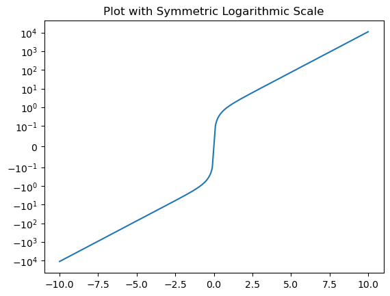
In this example plt.yscale('symlog', linthresh=0.1) sets the y-axis to a symmetric logarithmic scale with a linear threshold (linthresh) of 0.1. Values closer to zero will be displayed linearly while those farther from zero will follow a logarithmic scale.
import matplotlib.pyplot as plt
import numpy as np
x = np.linspace(-10, 10, 500)
y = np.sinh(x)
plt.plot(x, y)
plt.yscale('symlog', linthresh=0.1)  # Applying symmetric logarithmic scale for y-axis
plt.title('Plot with Symmetric Logarithmic Scale')
plt.show()
Output
Plot with Different Scales
In this example we are plotting the plot with different scales using the matplotlib library.
Example
import numpy as np
import matplotlib.pyplot as plt

plt.rcParams["figure.figsize"] = [7.50, 3.50]
plt.rcParams["figure.autolayout"] = True

t = np.arange(0.01, 10.0, 0.01)
data1 = np.exp(t)
data2 = np.sin(2 * np.pi * t)
fig, ax1 = plt.subplots()
color = 'red'

ax1.set_xlabel('time (s)')
ax1.set_ylabel('exp', color=color)
ax1.plot(t, data1, color=color)
ax1.tick_params(axis='y', labelcolor=color)
ax2 = ax1.twinx()

color = 'blue'
ax2.set_ylabel('sin', color=color)
ax2.plot(t, data2, color=color)
ax2.tick_params(axis='y', labelcolor=color)

plt.show()
Output
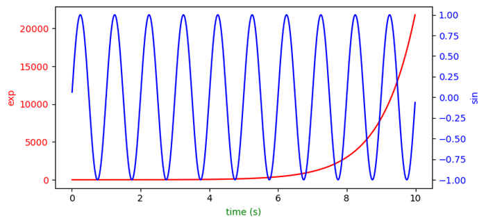
Multiple axes in Matplotlib with different scales
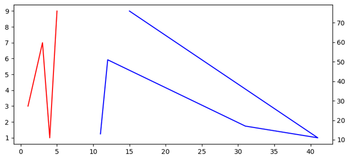
In this example we will see how to create a shared Y-axis.
Example
import matplotlib.pyplot as plt
fig, ax1 = plt.subplots()
ax1.plot([1, 2, 3, 4, 5], [3, 5, 7, 1, 9], color='red')
ax2 = ax1.twinx()
ax2.plot([11, 12, 31, 41, 15], [13, 51, 17, 11, 76], color='blue')
fig.tight_layout()
plt.show()
Output
