- CSS Tutorial
- CSS - Home
- CSS - Introduction
- CSS - Syntax
- CSS - Selectors
- CSS - Inclusion
- CSS - Measurement Units
- CSS - Colors
- CSS - Backgrounds
- CSS - Fonts
- CSS - Text
- CSS - Images
- CSS - Links
- CSS - Tables
- CSS - Borders
- CSS - Border Block
- CSS - Border Inline
- CSS - Margins
- CSS - Lists
- CSS - Padding
- CSS - Cursor
- CSS - Outlines
- CSS - Dimension
- CSS - Scrollbars
- CSS - Inline Block
- CSS - Dropdowns
- CSS - Visibility
- CSS - Overflow
- CSS - Clearfix
- CSS - Float
- CSS - Arrows
- CSS - Resize
- CSS - Quotes
- CSS - Order
- CSS - Position
- CSS - Hyphens
- CSS - Hover
- CSS - Display
- CSS - Focus
- CSS - Zoom
- CSS - Translate
- CSS - Height
- CSS - Hyphenate Character
- CSS - Width
- CSS - Opacity
- CSS - Z-Index
- CSS - Bottom
- CSS - Navbar
- CSS - Overlay
- CSS - Forms
- CSS - Align
- CSS - Icons
- CSS - Image Gallery
- CSS - Comments
- CSS - Loaders
- CSS - Attr Selectors
- CSS - Combinators
- CSS - Root
- CSS - Box Model
- CSS - Counters
- CSS - Clip
- CSS - Writing Mode
- CSS - Unicode-bidi
- CSS - min-content
- CSS - All
- CSS - Inset
- CSS - Isolation
- CSS - Overscroll
- CSS - Justify Items
- CSS - Justify Self
- CSS - Tab Size
- CSS - Pointer Events
- CSS - Place Content
- CSS - Place Items
- CSS - Place Self
- CSS - Max Block Size
- CSS - Min Block Size
- CSS - Mix Blend Mode
- CSS - Max Inline Size
- CSS - Min Inline Size
- CSS - Offset
- CSS - Accent Color
- CSS - User Select
- CSS Advanced
- CSS - Grid
- CSS - Grid Layout
- CSS - Flexbox
- CSS - Visibility
- CSS - Positioning
- CSS - Layers
- CSS - Pseudo Classes
- CSS - Pseudo Elements
- CSS - @ Rules
- CSS - Text Effects
- CSS - Paged Media
- CSS - Printing
- CSS - Layouts
- CSS - Validations
- CSS - Image Sprites
- CSS - Important
- CSS - Data Types
- CSS3 Tutorial
- CSS3 - Tutorial
- CSS - Rounded Corner
- CSS - Border Images
- CSS - Multi Background
- CSS - Color
- CSS - Gradients
- CSS - Box Shadow
- CSS - Box Decoration Break
- CSS - Caret Color
- CSS - Text Shadow
- CSS - Text
- CSS - 2d transform
- CSS - 3d transform
- CSS - Transition
- CSS - Animation
- CSS - Multi columns
- CSS - Box Sizing
- CSS - Tooltips
- CSS - Buttons
- CSS - Pagination
- CSS - Variables
- CSS - Media Queries
- CSS - Functions
- CSS - Math Functions
- CSS - Masking
- CSS - Shapes
- CSS - Style Images
- CSS - Specificity
- CSS - Custom Properties
- CSS Responsive
- CSS RWD - Introduction
- CSS RWD - Viewport
- CSS RWD - Grid View
- CSS RWD - Media Queries
- CSS RWD - Images
- CSS RWD - Videos
- CSS RWD - Frameworks
- CSS References
- CSS - Questions and Answers
- CSS - Quick Guide
- CSS - References
- CSS - Color References
- CSS - Web browser References
- CSS - Web safe fonts
- CSS - Units
- CSS - Animation
- CSS Resources
- CSS - Useful Resources
- CSS - Discussion
CSS RWD Introduction
Responsive Web Design (RWD) is a web-designing and development approach that makes the web pages render well and correctly on various devices with different screen sizes and resolutions.
The motive of responsive web design is to ensure that the user experience is consistent and optimized regardless of whether the website is viewed on a mobile device, a desktop computer, laptop, or a tablet.
RWD Structure
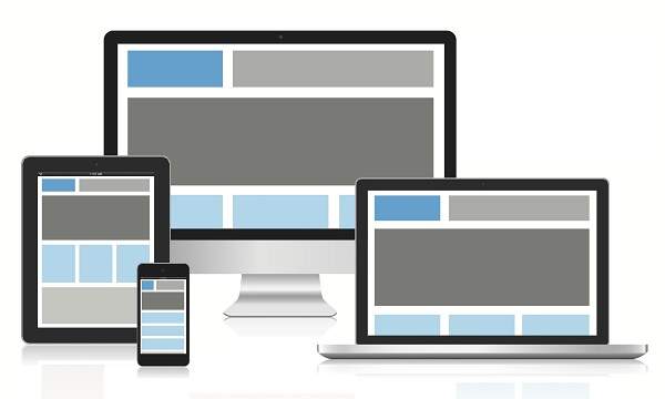
The following figure describes the structure of responsive web designing, where the same page can be viewed optimally on different kinds of devices of varied sizes and resolutions.

Cascading Style Sheets (CSS) plays a crucial role in responsive web designing. Following are few of the concepts and techniques that are used in CSS for responsive web designing:
Media Queries: Media queries allow you to apply CSS rules based on characteristics of the device, such as its screen width, height, or even its orientation (landscape or portrait). By using media queries, you can define different styles for different devices.
Flexible Grid Layouts: Instead of using fixed-width layouts, responsive designs often use flexible grid layouts. CSS frameworks like Bootstrap provide grid systems that automatically adjust the layout based on the screen size.
Flexible Images and Media: Images and other media elements, such as videos, can be made responsive by using the max-width: 100% property. This ensures that images scale down proportionally within their parent containers.
Viewport Meta Tag: The viewport meta tag is used in the HTML <head> to control the viewport behavior and scale on mobile devices. It is crucial for ensuring proper rendering on various screen sizes.