- CSS Tutorial
- CSS - Home
- CSS - Introduction
- CSS - Syntax
- CSS - Selectors
- CSS - Inclusion
- CSS - Measurement Units
- CSS - Colors
- CSS - Backgrounds
- CSS - Fonts
- CSS - Text
- CSS - Images
- CSS - Links
- CSS - Tables
- CSS - Borders
- CSS - Border Block
- CSS - Border Inline
- CSS - Margins
- CSS - Lists
- CSS - Padding
- CSS - Cursor
- CSS - Outlines
- CSS - Dimension
- CSS - Scrollbars
- CSS - Inline Block
- CSS - Dropdowns
- CSS - Visibility
- CSS - Overflow
- CSS - Clearfix
- CSS - Float
- CSS - Arrows
- CSS - Resize
- CSS - Quotes
- CSS - Order
- CSS - Position
- CSS - Hyphens
- CSS - Hover
- CSS - Display
- CSS - Focus
- CSS - Zoom
- CSS - Translate
- CSS - Height
- CSS - Hyphenate Character
- CSS - Width
- CSS - Opacity
- CSS - Z-Index
- CSS - Bottom
- CSS - Navbar
- CSS - Overlay
- CSS - Forms
- CSS - Align
- CSS - Icons
- CSS - Image Gallery
- CSS - Comments
- CSS - Loaders
- CSS - Attr Selectors
- CSS - Combinators
- CSS - Root
- CSS - Box Model
- CSS - Counters
- CSS - Clip
- CSS - Writing Mode
- CSS - Unicode-bidi
- CSS - min-content
- CSS - All
- CSS - Inset
- CSS - Isolation
- CSS - Overscroll
- CSS - Justify Items
- CSS - Justify Self
- CSS - Tab Size
- CSS - Pointer Events
- CSS - Place Content
- CSS - Place Items
- CSS - Place Self
- CSS - Max Block Size
- CSS - Min Block Size
- CSS - Mix Blend Mode
- CSS - Max Inline Size
- CSS - Min Inline Size
- CSS - Offset
- CSS - Accent Color
- CSS - User Select
- CSS Advanced
- CSS - Grid
- CSS - Grid Layout
- CSS - Flexbox
- CSS - Visibility
- CSS - Positioning
- CSS - Layers
- CSS - Pseudo Classes
- CSS - Pseudo Elements
- CSS - @ Rules
- CSS - Text Effects
- CSS - Paged Media
- CSS - Printing
- CSS - Layouts
- CSS - Validations
- CSS - Image Sprites
- CSS - Important
- CSS - Data Types
- CSS3 Tutorial
- CSS3 - Tutorial
- CSS - Rounded Corner
- CSS - Border Images
- CSS - Multi Background
- CSS - Color
- CSS - Gradients
- CSS - Box Shadow
- CSS - Box Decoration Break
- CSS - Caret Color
- CSS - Text Shadow
- CSS - Text
- CSS - 2d transform
- CSS - 3d transform
- CSS - Transition
- CSS - Animation
- CSS - Multi columns
- CSS - Box Sizing
- CSS - Tooltips
- CSS - Buttons
- CSS - Pagination
- CSS - Variables
- CSS - Media Queries
- CSS - Functions
- CSS - Math Functions
- CSS - Masking
- CSS - Shapes
- CSS - Style Images
- CSS - Specificity
- CSS - Custom Properties
- CSS Responsive
- CSS RWD - Introduction
- CSS RWD - Viewport
- CSS RWD - Grid View
- CSS RWD - Media Queries
- CSS RWD - Images
- CSS RWD - Videos
- CSS RWD - Frameworks
- CSS References
- CSS - Questions and Answers
- CSS - Quick Guide
- CSS - References
- CSS - Color References
- CSS - Web browser References
- CSS - Web safe fonts
- CSS - Units
- CSS - Animation
- CSS Resources
- CSS - Useful Resources
- CSS - Discussion
CSS - Box Model
CSS Box Model is a fundamental concept in CSS (Cascading Style Sheets) that define how an elements on a web page will be structured and displayed. It defines the properties and behavior of the content, padding, borders, and margins of an element. Here in this article you will learn all about the CSS Box Model.
What is CSS box model?
The CSS box model is a container that used to structure the elements in a webpage so the element can be displayed visually good. It consists of four essential components content, padding, border, and margin, as shown in the following diagram.

CSS Box Model Components
Lets understand each components in detail.
- Content: This is the innermost part of the box and refers to the actual content of an element, such as text, images, or other media. You can set its size using the properties such as inline size and block-size, also known as width and height.
- Padding: Represents the space between the content and the element's border. It can be applied separately to each side of the element (top, right, bottom, and left). The size of this box is set using padding and other related properties.
- Border: Defines a line or boundary around the padding and content of an element. The size, style and color of this box is set using border and other related properties.
- Margin: Represents the space outside the border of an element. Like padding, margins can also be set separately for each side and are typically used to create space between elements on a webpage. The size of this box is set using margin and other related properties.
The total space of an element occupies on the web page is the sum of its content width, padding, border, and margin. Understanding the CSS Box Model is crucial for designing and positioning elements on a webpage, as it allows you to control spacing, layout, and overall design.
Types of Box-Model
There are two types of box models as listed below.
Browsers use the standard box model, by default. Let us look into both the types of box models in the following sections.
Standard CSS Box Model
In standard box-model, height and width properties include only the content area of element. Padding, borders, and margins are added outside the content area.
Consider the following styling box. Let us calculate the actual space taken by the box:
.box {
   width: 300px;
   height: 100px;
   margin: 20px;
   padding: 15px;
   border: 5px solid green;
}
Standard Box Model Dimension Calculation
The box area is only upto the margin, and thus margin area does not add up to the final space taken by the box.
- Total width = 300(width) + 15(left padding) + 15(right padding) + 5(left border) + 5(right border) = 340px
- Total height = 100(height) + 15(top padding) + 15(bottom padding) + 5(top border) + 5(bottom border) = 140px
Standard Box-Model Example
The following example shows how to define a standard box model in HTML. Here we given the default value `content-box` for `box-sizing` property. Here we can notice that width of padding and border is included in offsetWidth of the element.
<!DOCTYPE html>
<html lang="en">
<head>
    <style>
        .box {
            width: 300px;
            height: 100px;
            padding: 20px;
            border: 10px solid black;
            margin: 30px;
            /* This is the default value */
            box-sizing: content-box;
        }
    </style>
</head>
<body>
    <div class="box" id="myBox">
      Total Width = 300 (content) + 20 (padding
      left) + 20 (padding right) + 10 (border
      left) + 10(border right) = 360 px
    </div>
    <p id="dis"></p>

    <script>
        // Get the div element
        var box = document.getElementById('myBox');
        // Get total width of element
        var totalWidth = box.offsetWidth;

        document.getElementById('dis').innerText =
        'Width of the div using offsetWidth property: '
        + totalWidth + 'px';
    </script>
</body>
</html>
Alternative Box Model
In case of an alternative box model, the actual width of an element is the value of width that is passed to it and same is the case with height. There is no need of adding the padding and border while calculating the actual size of the box. In order to enable or turn on the alternative box model for an element, you need to set box-sizing: border-box on it.
.box {
    box-sizing: border-box;
}
Let us consider the same dimensions of the box, as mentioned in standard box model example and calculate the actual space taken by the box:
.box {
   width: 300px;
   height: 100px;
   margin: 20px;
   padding: 15px;
   border: 5px solid green;
   box-sizing: border-box;
}
Alternate Box Model Dimension Calculation
The space taken by the box having dimensions listed up will be.
- Total width = width = 300px
- Total height = height = 100px
Alternative Box-Model Example
Here is an example alternative box models. Here we changed `box-sizing` property to `border-box`, hence total width of element not include width of border and padding.
<!DOCTYPE html>
<html lang="en">
<head>
    <style>
        .box {
            width: 300px;
            height: 150px;
            padding: 20px;
            border: 10px solid black;
            margin: 30px;
            /* Change this property to see difference */
            box-sizing: border-box;
        }
    </style>
</head>
<body>
    <div class="box" id="myBox">
        Total Width = 300 px <br>
        Total Height = 150 px

    </div>
    <p id="dis"></p>

    <script>
        // Get the div element
        var box = document.getElementById('myBox');
        // Get the total width of element
        var totalWidth = box.offsetWidth;

        document.getElementById('dis').innerText =
        'Total width of div using offsetWidth property: '
        + totalWidth + 'px';
    </script>
</body>
</html>
Significance of Box-Model
- Visual Representation: The box model allows developers to visualize and understand how elements are structured and how they will appear on the web page.
- Layout and Positioning: The box model affects the layout and positioning of elements on a web page.
- Size Calculations: The box model allows for precise calculations of element dimensions, including the width and height.
- Control and Customization: With the box model, developers have fine-grained control over the appearance of elements.
- Responsive Design: The box model plays a crucial role in responsive web design, where elements need to adapt and respond to different screen sizes and devices.
Box Model & Inline Boxes
The inline elements also have boxes around them. They also have margin, padding, borders, just like any other box.
Example
Here is an example where the box model around an inline element <p> is explained. Refer the diagram for detail description.
<html>
<head>
<style>
   p {
      padding: 1em 2em;
      margin: 5px 10px;
      border: 5px solid red;
      width: 200px;
   }
</style>
</head>
<body>
   <h1>Box model</h1>
   <p>Example for a box model.</p>
</body>
</html>
Display as Inline Block
An element with display: inline-block, respects the width and height values. And the values of padding, border, and margin will push away other elements, from the box.
This feature is useful in cases where you want to give a larger area for an element, for example, a link <a>. You can use the display: inline-block on that element along with padding and other related properties.
Example 1
<html>
<head>
<style>
   a {
      padding: 1em 2em;
      margin: 5px 10px;
      border: 5px solid red;
      width: 50px;
      display: inline-block;
      background-color: beige;
      font-size: 1em;
   }
</style>
</head>
<body>
   <h1>display: inline-block</h1>
   <a href="">First</a>
   <a href="">Second</a>
   <a href="">Third</a>
</body>
</html>
Example 2
Here in the code try to reduce the margin, padding, or border, to see the shift in the inline elements.
<html>
<head>
<style>
   a {
      padding: 0em 2em;
      margin: 10px 10px;
      border: 5px solid red;
      width: 50px;
      background-color: beige;
      font-size: 1em;
   }
</style>
</head>
<body>
   <p>
      The display:inline-block respects the
      width of the element. Here it is applied
      on the link <a href="">First</a>.
      As you change the value of padding, margin
      or/and border you can see the change.
    </p>
</body>
</html>
Block and Inline Boxes
CSS offers different types of boxes that are either block boxes or inline boxes. The way these boxes are displayed, it can be of two types: inner display type and outer display type.
Display of a box can be set using the display property of CSS, which have various values. Based on these values the display can be determined.
Refer the diagram for a better understanding of 'display: block | inline'.
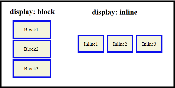
For detailed information and examples of display property in CSS, visit CSS display property article.