- Big Data Analytics Tutorial
- Big Data Analytics - Home
- Big Data Analytics - Overview
- Big Data Analytics - Characteristics
- Big Data Analytics - Data Life Cycle
- Big Data Analytics - Architecture
- Big Data Analytics - Methodology
- Big Data Analytics - Core Deliverables
- Big Data Adoption & Planning Considerations
- Big Data Analytics - Key Stakeholders
- Big Data Analytics - Data Analyst
- Big Data Analytics - Data Scientist
- Big Data Analytics Project
- Data Analytics - Problem Definition
- Big Data Analytics - Data Collection
- Big Data Analytics - Cleansing data
- Big Data Analytics - Summarizing
- Big Data Analytics - Data Exploration
- Big Data Analytics - Data Visualization
- Big Data Analytics Methods
- Big Data Analytics - Introduction to R
- Data Analytics - Introduction to SQL
- Big Data Analytics - Charts & Graphs
- Big Data Analytics - Data Tools
- Data Analytics - Statistical Methods
- Advanced Methods
- Machine Learning for Data Analysis
- Naive Bayes Classifier
- K-Means Clustering
- Association Rules
- Big Data Analytics - Decision Trees
- Logistic Regression
- Big Data Analytics - Time Series
- Big Data Analytics - Text Analytics
- Big Data Analytics - Online Learning
- Big Data Analytics Useful Resources
- Big Data Analytics - Quick Guide
- Big Data Analytics - Resources
- Big Data Analytics - Discussion
Big Data Analytics - Charts & Graphs
The first approach to analyzing data is to visually analyze it. The objectives at doing this are normally finding relations between variables and univariate descriptions of the variables. We can divide these strategies as −
- Univariate analysis
- Multivariate analysis
Univariate Graphical Methods
Univariate is a statistical term. In practice, it means we want to analyze a variable independently from the rest of the data. The plots that allow to do this efficiently are −
Box-Plots
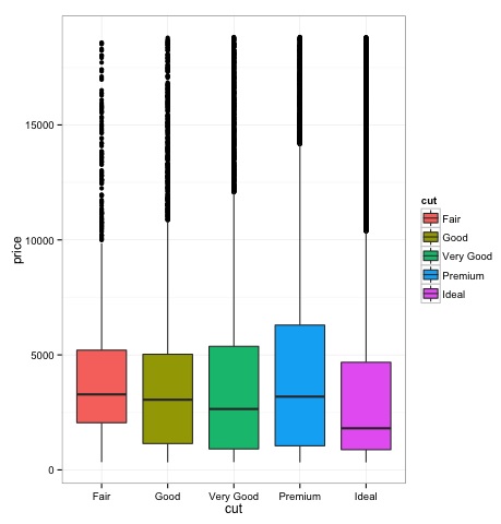
Box-Plots are normally used to compare distributions. It is a great way to visually inspect if there are differences between distributions. We can see if there are differences between the price of diamonds for different cut.
# We will be using the ggplot2 library for plotting
library(ggplot2)
data("diamonds")

# We will be using the diamonds dataset to analyze distributions of numeric variables
head(diamonds)

#    carat   cut       color  clarity  depth  table   price    x     y     z
# 1  0.23    Ideal       E      SI2    61.5    55     326     3.95  3.98  2.43
# 2  0.21    Premium     E      SI1    59.8    61     326     3.89  3.84  2.31
# 3  0.23    Good        E      VS1    56.9    65     327     4.05  4.07  2.31
# 4  0.29    Premium     I      VS2    62.4    58     334     4.20  4.23  2.63
# 5  0.31    Good        J      SI2    63.3    58     335     4.34  4.35  2.75
# 6  0.24    Very Good   J      VVS2   62.8    57     336     3.94  3.96  2.48

### Box-Plots
p = ggplot(diamonds, aes(x = cut, y = price, fill = cut)) +
   geom_box-plot() +
   theme_bw()
print(p)
We can see in the plot there are differences in the distribution of diamonds price in different types of cut.

Histograms
source('01_box_plots.R')

# We can plot histograms for each level of the cut factor variable using
facet_grid
p = ggplot(diamonds, aes(x = price, fill = cut)) +
   geom_histogram() +
   facet_grid(cut ~ .) +
   theme_bw()

p
# the previous plot doesn’t allow to visuallize correctly the data because of
the differences in scale
# we can turn this off using the scales argument of facet_grid

p = ggplot(diamonds, aes(x = price, fill = cut)) +
   geom_histogram() +
   facet_grid(cut ~ ., scales = 'free') +
   theme_bw()
p

png('02_histogram_diamonds_cut.png')
print(p)
dev.off()
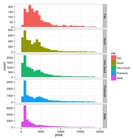
The output of the above code will be as follows −

Multivariate Graphical Methods
Multivariate graphical methods in exploratory data analysis have the objective of finding relationships among different variables. There are two ways to accomplish this that are commonly used: plotting a correlation matrix of numeric variables or simply plotting the raw data as a matrix of scatter plots.
In order to demonstrate this, we will use the diamonds dataset. To follow the code, open the script bda/part2/charts/03_multivariate_analysis.R.
library(ggplot2)
data(diamonds)

# Correlation matrix plots
keep_vars = c('carat', 'depth', 'price', 'table')
df = diamonds[, keep_vars]
# compute the correlation matrix
M_cor = cor(df)

#          carat       depth      price      table
# carat 1.00000000  0.02822431  0.9215913  0.1816175
# depth 0.02822431  1.00000000 -0.0106474 -0.2957785
# price 0.92159130 -0.01064740  1.0000000  0.1271339
# table 0.18161755 -0.29577852  0.1271339  1.0000000

# plots
heat-map(M_cor)
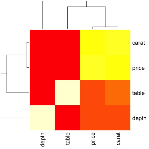
The code will produce the following output −

This is a summary, it tells us that there is a strong correlation between price and caret, and not much among the other variables.
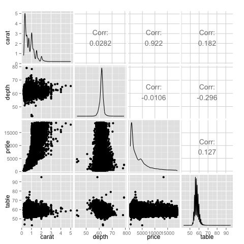
A correlation matrix can be useful when we have a large number of variables in which case plotting the raw data would not be practical. As mentioned, it is possible to show the raw data also −
library(GGally)
ggpairs(df)
We can see in the plot that the results displayed in the heat-map are confirmed, there is a 0.922 correlation between the price and carat variables.

It is possible to visualize this relationship in the price-carat scatterplot located in the (3, 1) index of the scatterplot matrix.